A lot of websites creates powerful first impressions with color, the right selection of vivid images and useful content. But rip off the color, videos, images, content, what is left? You’ll come down to the bare bones of a website and suddenly understand: it’s the layout that really pumps brilliance into the website.
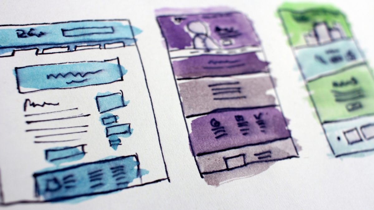
A website layout is a pattern that defines a website’s structure. Its main role is to arrange and put up a structure to the information available on a site both for the website’s owner and for users. It allows you to navigate well within web pages and highlights the most important elements of a website.
Below are some basic principles that will make your website aesthetically pleasing, easy to use, engaging, and effective:
1. Purpose
Good web layout always address the needs of the user. Each page of your website needs to highlight the right elements to create a clear purpose for the web page, and to fulfill a specific need for your website users in the most effective way possible.
2. Communication
The primary goal of a person diving in the internet is to acquire information, so it is important to communicate clearly, and make your information easy to read and digest. Organising information using headlines and sub headlines, is a good way to guide your users in the right direction.
3. Navigation
Navigation is about how easy and seamless it is for people to move around your website. Some useful tips for effective navigation include a page hierarchy, incorporating clickable buttons, and following the ‘three click rule’ which means users will be able to find the information they are looking for within three clicks.
4. Grid based layouts
Grid based layouts arrange content into sections, columns and boxes that line up and feel balanced, which leads to a better looking website design.
5. “F” Pattern design
Eye tracking studies have identified that people scan computer screens in an “F” pattern. Most of what people see is in the top and left of the screen and the right side of the screen is rarely seen. Effectively designed websites will work with a reader’s natural behaviour and display information in order of importance (left to right, and top to bottom).
6. Mobile friendly
Multiple devices with multiple screen sizes have become a common thing when accessing websites, so it is important to consider if your website is mobile friendly.
—
Now, that you’ve got some tips on how you can improve the functionality of your website, it’s time you consider what particular layout is the best fit for your website.
To do this, you should know your audience, their behavior, needs and expectancies, and built the appropriate message that molds perfectly on a layout. The layout will have the role to let the message shine and be so convincing for the users, that they cannot but accept it.